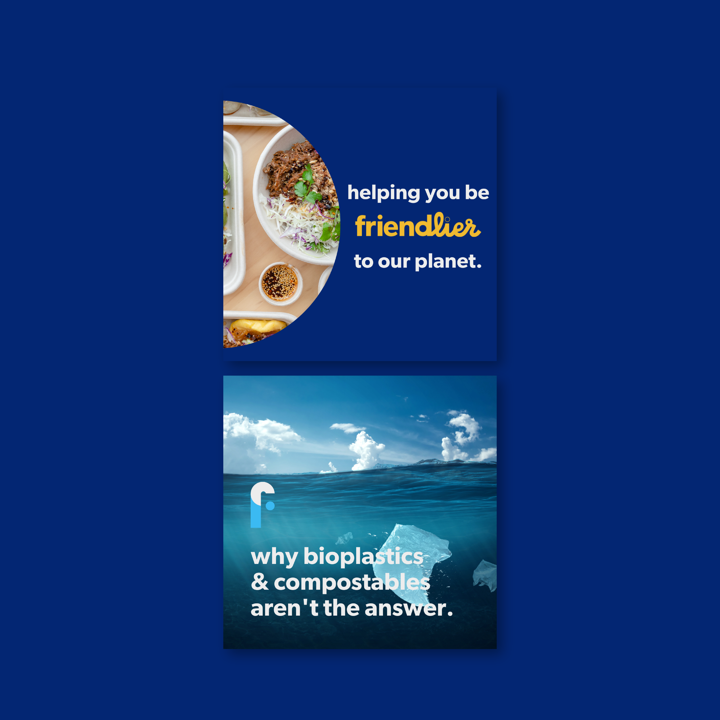
FRIENDLIER
Simplifying the world’s transition from single-use to reusable food packaging.
Brand Strategy
Brand Identity Design
Creative Retainer / Branded Content
With a powerful mission to simplify reuse for the food service industry, Friendlier came to Field & Co. to refresh and re-invigorate their brand. With plans to transition their brand name (formerly A Friendlier Company), Friendlier needed a more modern and consistent way to attract new users. Friendlier presented a unique design problem: appealing to both consumers and food service industry professionals.

OUR SOLUTION
For Friendlier’s primary logomark, we paired a fun and youthful script with a clean sans-serif to create a harmony between structured and approachable. The flowing of the letters helps to portray the convenience and ease of Friendlier’s service. Rounded edges and circular shapes throughout the logo embody friendlines.
exciting
🌎
sustainable
💙
clean
🥗
impactful
🌊
energetic
👩🏼🔧
exciting 🌎 sustainable 💙 clean 🥗 impactful 🌊 energetic 👩🏼🔧
THE STRATEGY
Because Friendlier is a new brand with a fresh, innovative solution to reduce single-use plastics, their brand needed to reflect this. Friendlier has big growth goals over the next few years and their new branding will help them to attract new customers, new restaurants and appeal to investors. An exciting face for an exciting company. The world needs to hear what Friendlier has to say and with a fun and fresh new look, we’re encouraging people to listen.

“As business owners, we feel a lot more confident about our brand. We feel confident giving presentations and showing off our digital assets. Everything we have looks and feels extremely professional now. We have received incredible feedback from all of our customers, followers, and stakeholders.”
– Jacquie Hutchings, Friendlier
THE CREATIVE PROCESS
All of the best projects start with collaboration and exploration. By exploring what doesn’t work, we’re able to figure out what does. The creative process is different for everyone and here at Field & Co. it’s the foundation of everything we do.
With your expertise in your business/industry and our killer design and brand strategy skills, we create a pretty f*cking awesome cocktail.
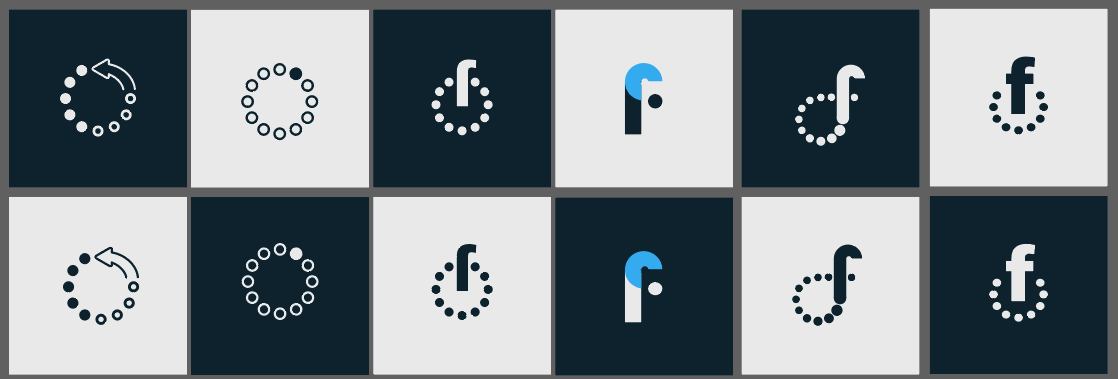
Friendlier’s logo exploration was nothing short of EXHILARATING. Here you can take a peak at our initial sketches, concepts and how that informed Friendlier’s final branding suite.


